The math and CSS of responsive type scales
A type scale is a popular way to define the relationships between different font sizes. There are great tools out there for creating type scales for the web: Typescale lets you create a simple type scale for free and will generate the CSS for use on the web. And responsive type scales — a technique that has been around since at least 2015 and that has been more recently popularized by Utopia.fyi — use viewport units to create a set of responsive type scales that respond to the size of the browser window.
Tools like Utopia are great, and there’s no reason not to use them (I certainly do!), but it can feel like they just spit out code to copy and paste with no real explanation. There are plenty of reasons to know how these tools work. For example, you could define the inputs to a type scale as design tokens and write a script for a build system to generate the appropriate CSS; you could have the parameters of your type scale adjustable by end users; or maybe you’re just curious how they come up with those seemingly magic numbers!
This post is divided up into two main sections: the math, and the CSS, with a bonus section (CSS of the future!) at the end. The math section covers more of the what, while the CSS section covers the how.
The math
A simple type scale
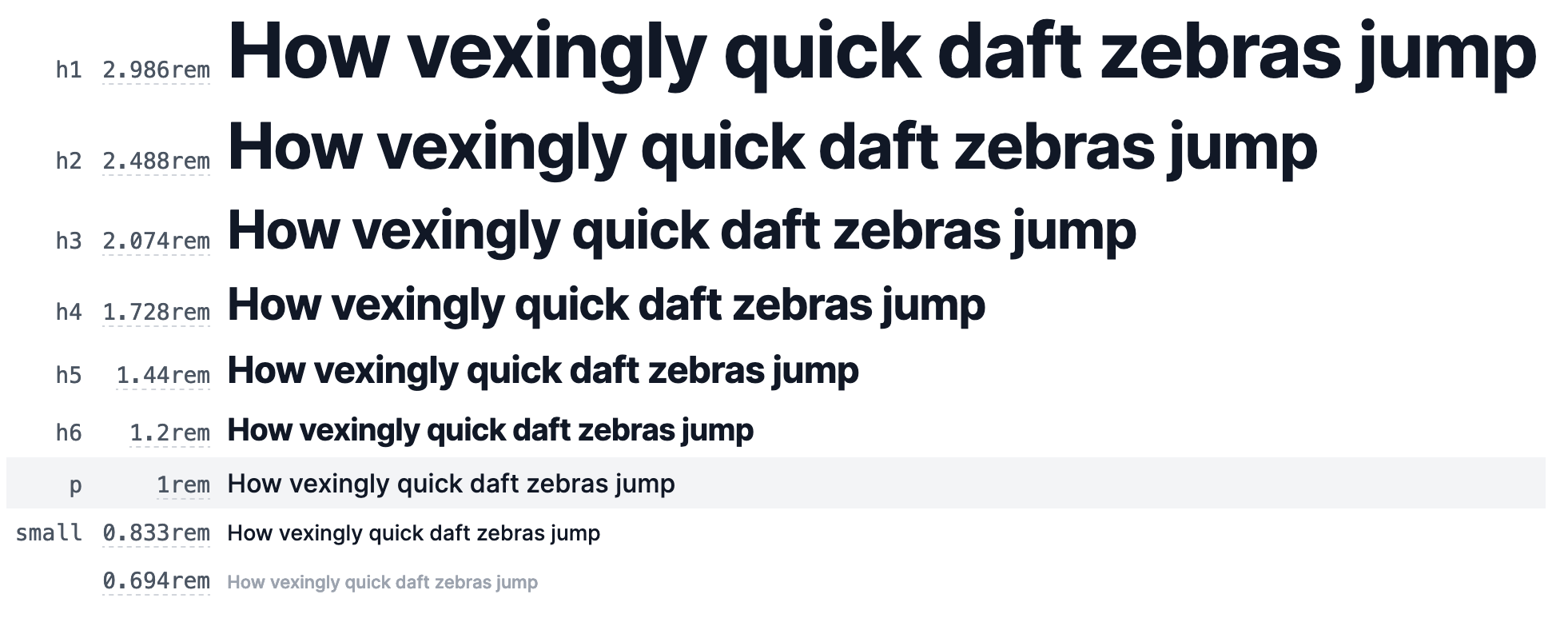
To start, let’s forget about responsiveness and define a single type scale. A type scale is defined by two numbers: the base (“step 0”) font size, and the ratio between each step. The base font size of the type scale is typically what you want to use for main body text, so it’s generally around 1rem (16px at standard zoom). The ratio is the number by which to multiply a step in order to get the next step. It’s typically between 1 and 1.5. For example, if step 0 is 1rem and the ratio is 1.2, step 1 is is and step 2 is . More generally, in the table below, each row is the value of the previous row times 1.2.
| Step | Cumulative | Expanded | Value |
|---|---|---|---|
| Step 0 | 1rem | 1rem | 1rem |
| Step 1 | 1rem × 1.2 | 1rem × 1.2 | 1.2rem |
| Step 2 | 1.2rem × 1.2 | 1rem × 1.2 × 1.2 | 1.44rem |
| Step 3 | 1.44rem × 1.2 | 1rem × 1.2 × 1.2 × 1.2 | 1.728rem |
The cumulative column is a useful way of looking at it (especially when we get to implementing a type scale in CSS for reasons that we’ll get into in a bit) but the expanded column may remind you of exponents: a number times itself times is , that number to the power of . So with a base size of and a scale ratio of , a type scale at step is
As you vary the scale ratio , the absolute difference between each step increases or decreases, and as you vary the base font size , the starting point (and everything up and down the scale) changes. Note that this is exponential growth (😷), so increasing the base size or ratio even a little bit can increase a later scale degree by quite a lot!
By the way, if you’re curious why these ratios are often labeled with musical intervals, I have an old post from 2011 on musical intervals and math.
A responsive type scale
So that’s a single type scale, but what about a fluid, dynamic type scale like we get from Utopia.fyi? Looking at the controls for Utopia, we can see that you can provide three inputs for each of the two ends: viewport size, base font size, and type scale ratio. So what we want is two separate scales at two extremes of a viewport (or container) size.
So let’s set up two scales just like the single scale above, but with different base sizes and ratios:
Since we have two type scales, each scale degree now has two values (connected by the purple lines): one for the small viewport and one for the large viewport. Here they’re plotted as before, with scale degree on the axis and font size on , but let’s bring viewport width into the picture.[1] If we plot each of those pairs of font sizes by viewport width instead of scale degree, we now have one line for each scale degree, with end points at the narrowest and widest viewports we specified.
The lines between the endpoints represent linear interpolation from one scale to the other as the viewport changes. For any viewport size along the axis, the position on a scale’s line indicates the corresponding font size.
For each scale degree, we need the equation of that line. In other words, we want to find the function that takes viewport width as input and gives a font size as its output. Finding the equation of a line between two points is a matter of algebra. (Remember sixth grade math class? 😅)[2]
There are a few standard ways of describing a line, but looking at the output of Utopia, it’s clear that they’re using slope–intercept form[3]:
is the output, is the slope, is the input, and is the intercept (the point where it crosses the axis). But since we’re working with viewport width, let’s call the input instead of .
Let’s start by finding , the slope. The slope is the change in over the change in . “Rise over run”, as they say.
With that, we can solve for by plugging in the values from one of the two known points. Picking the small end of the scale and substituting the above for ,
Rearrange to solve for :
and are the two values we’ll need in CSS, but for the sake of completeness we can put these pieces together and simplify into a single expression to get
It’s great that we have a line, but we still need to make sure that even if the viewport size is smaller than or larger than it doesn’t keep shrinking or growing along that line. In other words, we need to clamp() it between the minimum and maximum font size for that scale degree.
If we want to be all fancy with the mathematical notation, it’s a piecewise function like this[4]. But let’s be honest, this one is just for show:
The point is, each scale degree can be described by a line with a slope and an intercept that is clamped to the high and low values outside the endpoints.
Checking our work, and a bit about CSS units
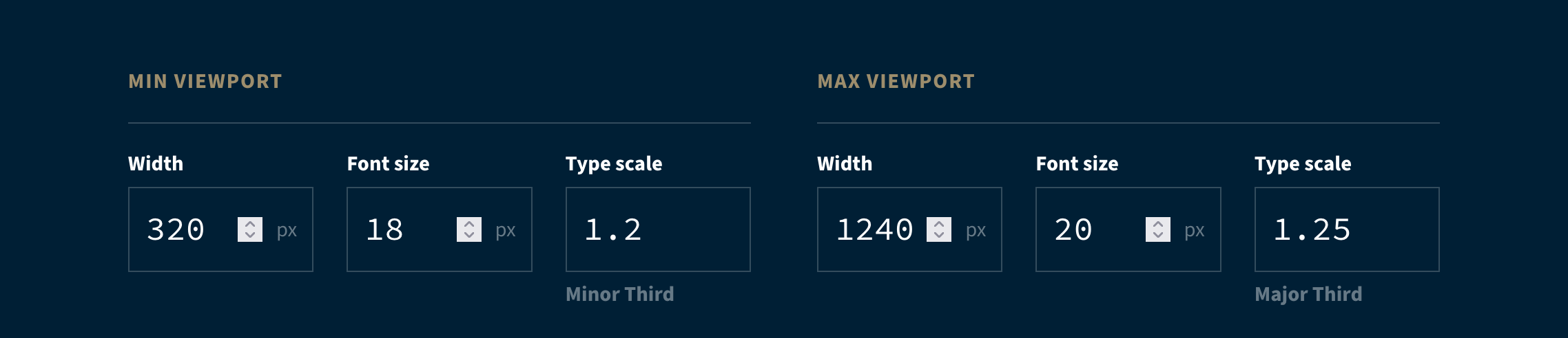
Ok, phew, we can finally switch gears from algebraic manipulation. Before moving on to CSS, we should check our work against Utopia with some numbers. Let’s use their default values. On the small side we have , , and , and on the large side we have , , and .
Scrolling down on the Utopia calculator page, we see the following CSS:
--step-0: clamp(1.125rem, 1.0815rem + 0.2174vw, 1.25rem);The middle argument to the clamp() function, 1.0815rem + 0.2174vw, is our line in slope–intercept form. The 1.0815rem is just a length independent of the viewport width, so that must be the intercept, . The 0.2174vw is also a length, but a length that depends on the viewport width — the input to our linear function — so it’s the slope, , times the input viewport width, .
But in order to verify our work against these numbers, we need convert them to pixels. Why? Because even though they’re different units, length units like rem and vw are what’s known as compatible units, so when doing math with them with calc(), the browser resolves them to their canonical unit, which is px. This is why we calculated the parameters of the line by using px for font size and viewport size.
Let’s take the intercept first. Utopia is assuming that there are 16px to the rem, which is true unless someone has changed their default font size or the page author messed with it[5].
That’s the number we’re looking for. Looking back at our equation for and plugging in the values for the and endpoints we get
Aside from a small rounding error, that’s spot on. Awesome.
For the slope, we need to tease apart what portion of 0.2174vw is the slope and which part is the width, . In our equation, is the width of the viewport in px. In CSS, the full width of the viewport is 100vw. That 100vw is resolved to px and becomes our . So really, since a slope is a unitless ratio, Utopia could have expressed this part of the equation as calc(0.002174 * 100vw); they just included the 100 from 100vw. So the value we want to get for from our equation is 0.002174. (It intuitively makes sense that this is a small number because the difference in font size from the smallest to the largest viewport is fairly modest.)
Let’s plug the input values from Utopia into our equation above for :
Again, just a bit of rounding, but we nailed it. 🎯 Now we get what Utopia is doing, and can implement it ourselves.
A responsive type scale in CSS
I don’t know whether it’s a good idea to implement an entire system of type scales in CSS (maybe there are performance reasons not to?), but it’s possible as a demo of how to put the algebra we just did into action.
The first thing we need is to set the input parameters of the scales, just as we would on Utopia:
:root {
	--viewport-small: 320; /* px */
	--base-size-small: 1.125; /* rem */
	--scale-at-small: 1.2;

	--viewport-large: 1240; /* px */
	--base-size-large: 1.25; /* rem */
	--scale-at-large: 1.25;
}
An odd thing that should jump out about this is that viewport and font sizes are numbers not lengths. This is because, as of now, it is not possible for calc() to divide by a value with a unit, nor is it possible to multiply two unit-ed values together. (This will hopefully be changing at some point.)
Step 0 is our base font size, so let’s define the endpoints. (Since the properties above are the “public API” of our type scale, I’ll use the convention of prepending _ to all of the “internal” custom properties.)
:root {
	/* ✂️ */
	--_small-step-0: var(--base-size-small);
	--_large-step-0: var(--base-size-large);
}
Before we get to slopes and intercepts, let’s now take the type scale ratios, --scale-at-small and --scale-at-large and apply them up and down the scale. Here you can see how, in the absence of pow()[6], we can get each step by multiplying the ratio by the previous step (like we did in the table at the top). We can also get steps down the scale by dividing by the ratio.
:root{
	/* ✂️ */
	--_small-step-1: var(--_small-step-0) * var(--scale-at-small);
	--_large-step-1: var(--_large-step-0) * var(--scale-at-large);

	--_small-step-2: var(--_small-step-1) * var(--scale-at-small);
	--_large-step-2: var(--_large-step-1) * var(--scale-at-large);

	--_small-step--1: var(--_small-step-0) / var(--scale-at-small);
	--_large-step--1: var(--_large-step-0) / var(--scale-at-large);
}
So that’s the type scale itself, but what about responsiveness? As we’ve been discussing, we’ll use viewport units and the clamp() function. clamp() takes three arguments: min, val, and max. It evaluates val, and if val is less than min it returns min, and if it’s greater than max it returns max. Otherwise, it returns val. In other words, it tries to return val when possible, but will never get smaller than min or greater than max.
You may have seen a simple example of responsive typography like
font-size: clamp(1rem, 3vw, 1.5rem);Here you can see that the font size takes the value of 3vw, which is a line with slope .003, but only where it’s greater than 1rem and less than 1.5rem. The problem is that you don’t have much control over the viewport widths where the transition from small to large start and end. That’s why, in the words of Mike Riethmuller, doing the extra math gives us “precise control”.
So now for the fun part: taking the equations we got in the last section to find the slopes and intercepts, and implementing them in CSS for each scale step. (As part of that, we’ll set a little utility variable for since it comes up repeatedly.)
:root {
	/* ✂️ */
	--_viewport-delta: calc(var(--viewport-large) - var(--viewport-small));

	/* ✂️ */
	--_m-step-0: calc((var(--_large-step-0) - var(--_small-step-0)) / var(--_viewport-delta));
	--_b-step-0: calc(var(--_small-step-0) - var(--_m-step-0) * var(--viewport-small));
	/* ✂️ */
	--_m-step-1: calc((var(--_large-step-1) - var(--_small-step-1)) / var(--_viewport-delta));
	--_b-step-1: calc(var(--_small-step-1) - var(--_m-step-1) * var(--viewport-small));
	/* ✂️ */
	--_m-step-2: calc((var(--_large-step-2) - var(--_small-step-2)) / var(--_viewport-delta));
	--_b-step-2: calc(var(--_small-step-2) - var(--_m-step-2) * var(--viewport-small));
	/* ✂️ */
	--_m-step--1: calc((var(--_large-step--1) - var(--_small-step--1)) / var(--_viewport-delta));
	--_b-step--1: calc(var(--_small-step--1) - var(--_m-step--1) * var(--viewport-small));
}
That may look like a lot, but it’s an exact copy of the and equations we worked out earlier, just in CSS instead of math notation.
The final step is to calculate the actual font size for each step using the slopes and intercepts we just calculated. Each step will look something like this:
:root {
	/* ✂️ */
	--px-per-rem: 16;
	/* ✂️ */
	--step-0: clamp(
		var(--_small-step-0) * 1rem,
		var(--_m-step-0) * 100vw * var(--px-per-rem) + var(--_b-step-0) * 1rem,
		var(--_large-step-0) * 1rem
	);
}
Just like Utopia, this relies on a clamp() function. The first and last arguments to the clamp() are simply taking the predefined endpoints, the largest and smallest allowable font sizes for that scale degree, and multiplying by 1rem in order to turn them from plain numbers into proper lengths.
The middle argument is our linear equation, . Take the slope, , multiply it by , which is 100vw, then multiply that by the number of pixels per rem. We have to do that last bit because we wanted to define our base font sizes in (unitless) rem, but the slope is necessarily calculated in pixels. And we can’t just multiply by 1rem because of the previously discussed limitations on calc()ing units. So instead, we declare a custom property for the number of pixels per rem and multiply by that. The intercept, , though, we can just multiply by 1rem since it’s just a number.
This, then, is the full thing:
:root {
	/* configuration */
	--viewport-small: 320; /* px */
	--base-size-small: 1.125; /* rem */
	--scale-at-small: 1.2;

	--viewport-large: 1240; /* px */
	--base-size-large: 1.25; /* rem */
	--scale-at-large: 1.25;

	/* the rest */

	--px-per-rem: 16;

	--_viewport-delta: calc(var(--viewport-large) - var(--viewport-small));

	--_small-step-0: var(--base-size-small);
	--_large-step-0: var(--base-size-large);
	--_m-step-0: calc((var(--_large-step-0) - var(--_small-step-0)) / var(--_viewport-delta));
	--_b-step-0: calc(var(--_small-step-0) - var(--_m-step-0) * var(--viewport-small));
	--step-0: clamp(
		var(--_small-step-0) * 1rem,
		var(--_m-step-0) * 100vw * var(--px-per-rem) + var(--_b-step-0) * 1rem,
		var(--_large-step-0) * 1rem
	);

	--_small-step-1: var(--_small-step-0) * var(--scale-at-small);
	--_large-step-1: var(--_large-step-0) * var(--scale-at-large);
	--_m-step-1: calc((var(--_large-step-1) - var(--_small-step-1)) / var(--_viewport-delta));
	--_b-step-1: calc(var(--_small-step-1) - var(--_m-step-1) * var(--viewport-small));
	--step-1: clamp(
		var(--_small-step-1) * 1rem,
		var(--_m-step-1) * 100vw * var(--px-per-rem) + var(--_b-step-1) * 1rem,
		var(--_large-step-1) * 1rem
	);

	--_small-step-2: var(--_small-step-1) * var(--scale-at-small);
	--_large-step-2: var(--_large-step-1) * var(--scale-at-large);
	--_m-step-2: calc((var(--_large-step-2) - var(--_small-step-2)) / var(--_viewport-delta));
	--_b-step-2: calc(var(--_small-step-2) - var(--_m-step-2) * var(--viewport-small));
	--step-2: clamp(
		var(--_small-step-2) * 1rem,
		var(--_m-step-2) * 100vw * var(--px-per-rem) + var(--_b-step-2) * 1rem,
		var(--_large-step-2) * 1rem
	);

	--_small-step--1: var(--_small-step-0) / var(--scale-at-small);
	--_large-step--1: var(--_large-step-0) / var(--scale-at-large);
	--_m-step--1: calc((var(--_large-step--1) - var(--_small-step--1)) / var(--_viewport-delta));
	--_b-step--1: calc(var(--_small-step--1) - var(--_m-step--1) * var(--viewport-small));
	--step--1: clamp(
		var(--_small-step--1) * 1rem,
		var(--_m-step--1) * 100vw * var(--px-per-rem) + var(--_b-step--1) * 1rem,
		var(--_large-step--1) * 1rem
	);
}
See the Pen Responsive type scale in CSS by Noah (@noleli) on CodePen.
CSS of the future
As I was writing this, I stumbled across some pretty interesting things in draft specifications for what may become CSS in the future.
I’ve already mentioned two of them, unit algebra and the pow() function. To that, I’ll add two more things in CSS Values and Units Level 5: progress() and calc-mix().
Here’s my interpretation based on my layperson’s reading of the spec:
progress() takes three values: a “progress value”, a start value, and an end value. It then returns the progress from 0 to 1 that represents the progress value’s position between the start and end values. For example, progress(100 from 0 to 200) would return .5.
calc-mix() also takes three arguments: a progress from 0–1, and two other values. It then linearly interpolates between the latter two values and gives the value at the progress point. For example, calc-mix(.5, 0, 200) would return 100.
Using progress(), we should be able find out how far between the minimum and maximum viewport size the current viewport is with
--_viewport-progress: progress(100vw from var(--viewport-small) to var(--viewport-large));Then, we can use that value as an input to calc-mix(). The latter two arguments are the exact functions that initially described the large and small type scales:
Since, in this hypothetical world, we also have pow(), those equations in CSS become
--_step-1-small: var(--base-size-small) * pow(var(--scale-at-small), 1);
--_step-1-large: var(--base-size-large) * pow(var(--scale-at-large), 1);
So we can put that all together and, if I understand the specs correctly, do the whole thing much more simply than today.
:root {
	--viewport-small: 320px;
	--base-size-small: 1.125rem;
	--scale-at-small: 1.2;

	--viewport-large: 1240px;
	--base-size-large: 1.25rem;
	--scale-at-large: 1.25;

	--_viewport-progress: clamp(0, progress(100vw from var(--viewport-small) to var(--viewport-large)), 1);

	--step-0: calc-mix(
		var(--viewport-progress),
		var(--base-size-small),
		var(--base-size-large)
	);

	--step-1: calc-mix(
		var(--viewport-progress),
		var(--base-size-small) * pow(var(--scale-at-small), 1),
		var(--base-size-large) * pow(var(--scale-at-large), 1)
	);

	--step-2: calc-mix(
		var(--viewport-progress),
		var(--base-size-small) * pow(var(--scale-at-small), 2),
		var(--base-size-large) * pow(var(--scale-at-large), 2)
	);

	--step--1: calc-mix(
		var(--viewport-progress),
		var(--base-size-small) * pow(var(--scale-at-small), -1),
		var(--base-size-large) * pow(var(--scale-at-large), -1)
	);
}
Neat. Here’s to the future of CSS!
Thanks to Sara Joy for her feedback!
If you have any comments, questions, or found any errors (of which I’m sure several exist), please reach out on Mastodon.
I don’t know enough about vertical languages to know whether it’s better to scale with width or with inline size, so I’m going to stick with width. ↩︎
A CSS-Tricks post from 2020 also explains this part. ↩︎
In his 2015 demo Precise control over responsive typography, Mike Riethmuller uses two-point form. This actually makes more sense when doing all the math in CSS, but less sense if you’re making a calculator because the result is less DRY. Since one of the goals of this post is to demystify Utopia, I’ll be working with slope–intercept form. ↩︎
A somewhat subtle distinction between a piecewise mathematical function and
clamp()is that a piecewise function limits the domain of the input, whereasclamp()limits the range of the output. The end result is the same, but it’s a thing to keep in mind. ↩︎This brings up the important point that if you’re going to use responsive typography, be sure to read Adrian Roselli’s post on responsive typography, zoom, and accessibility. ↩︎
As of this writing,
pow()is only supported in Safari and Firefox. ↩︎