Making room for long list markers with subgrid
The problem
When working with lists, it’s typical for list markers like numbers or bullets to overhang the list item content. On the web, lists (<ul> and <ol>) accomplish this with fixed padding — 40px by default.
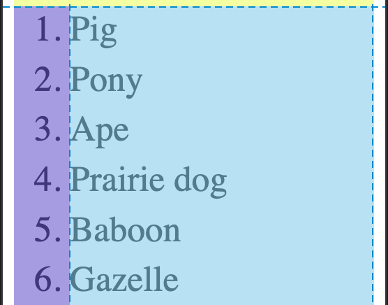
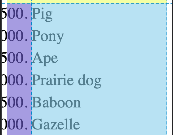
Most of the time this is fine, but sometimes markers can get quite wide. Here, I’m starting at 500 and counting up in steps of 500. 40px is clearly not enough space.
Traditionally, you need to make room by setting that padding to some wider value. For example, in her 2019 Smashing Mag article on CSS lists, Rachel Andrew added the word “Step” to numeric counters, then set padding-inline-start to 4em to account for the extra width. But that has magic number vibes, and only works if you know in advance how long your markers will get.
The solution
CSS subgrid to the rescue! Subgrid is a relatively new CSS feature that, as of September 2023, has landed in all major browsers[1]. In short, it allows a grandchild of a grid container to participate in its grandparent’s grid.
For our case, the concept is to make the list itself a grid container with two columns: one for the markers, and one for the list item content. Then, set each list item element to span both of those columns, but have its children — the marker and the <li>’s non-pseudo content — get subgrid-ed into the list’s two columns.
Start by setting up the <ol> as a grid container. The column for the marker is minmax(2.5rem, max-content) wide, meaning it’s always at least the browser default (2.5rem == 40px at default zoom) but can grow to be as wide as the widest marker content without any wrapping. The column for everything else takes up the rest of the space.
ol {
	/* don't need the default arbitrary padding */
	padding-inline: 0;

	display: grid;
	/* first column is the marker pseudoelement */
	grid-template-columns: minmax(40px, max-content) 1fr;
}
Next, the <li> needs to span both of the columns we just set up. We do that by setting grid-column to 1 / -1, which tells the browser to place the <li> starting at the first column grid line and ending at the last (-1) column grid line. Then, make it a grid container itself whose columns are, thanks to subgrid, the <ol>’s columns.
li {
/* the whole list item covers both columns. then *its* children (the marker and regular <li> content) are subgrid-ed into the parent's grid */
grid-column: 1 / -1;
display: grid;
/* use the parent grid's columns. neat! */
grid-template-columns: subgrid;
/* for demo purposes, let's see some wide numbers! */
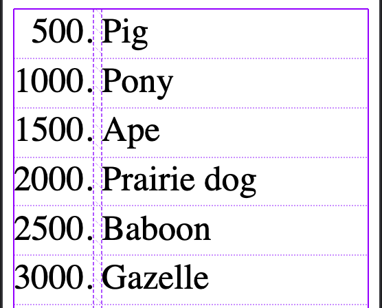
counter-increment: list-item +500;
}Now, there’s a bit of a catch: we just set the <li> to display: grid, which means it’s no longer display: list-item[2]. That means we lose the ::marker pseudoelement and have to use a ::before. That’s not a big deal, but it does mean we have to set it up ourselves:
li::before {
	content: counter(list-item)".";
	text-align: right;
}
One final thing is that, about a year ago, Šime Vidas wrote a very in-depth article about the space after a list marker. Using this subgrid technique introduces another possibility that feels very clean to me: we can add a gap after the list marker simply by setting the column-gap property in the parent <ol> grid.
ol {
	/* ✂️ */
	column-gap: .5ch;
	/* ✂️ */
}
Neat, an auto-sizing marker column with no magic numbers!
See the Pen Subgrid for list markers by Noah (@noleli) on CodePen.
Be sure to check availability before deciding to use it for your application. ↩︎
It’d be neat if one day
display’s two-value syntax supportedlist-item, so it could bedisplay: list-item grid. ↩︎